Biennially, representatives from the American Institute of Architects (AIA) and the American Library Association (ALA) gather to celebrate the finest examples of library design by architects licensed in the U.S. This year, for the 2013 AIA/ALA Library Building Awards, they choose to honor six outstanding project. View them all after the break.
Anacostia Neighborhood Library; Washington, D.C. / The Freelon Group

The small-scale residential context provided the inspiration for the design of this new branch library, located in a low-income, underserved neighborhood in Washington, D.C. The project not only fulfilled programmatic needs but also provided a stimulus for community pride and economic development.
The residential scale is reflected in the library design as a series of pavilions for program areas that require enclosure: the children’s program room, the young adults’ area, support spaces, and public meeting rooms. The remainder of the level one plan is high, open space for the main reading room, stacks, computers, and public seating areas. A large green roof structure provides shelter over all program areas.
Community input was also a key part of the design process. Users made it clear they wanted an open, welcoming building. The large front plaza invites pedestrians to come in, and the floor-to-ceiling glass on all sides provides passersby a clear view into the building. The building and site work together as a classroom for sustainable features and education about ecological systems, including a rain garden. The project received LEED® Gold certification.
Central Library Renovation; St. Louis / Cannon Design

Cass Gilbert’s grand Beaux-Arts library, now 100 years old and a St. Louis cultural landmark, was in need of a transformative restoration that would increase public access and modernize it for the 21st century.
On the interior, the centrally located Great Hall is surrounded by five wings, four dedicated to public reading rooms and the fifth, the north wing, to a multistory book depository closed to the public. The transformation of the north wing truly rejuvenated the library and brought it into the next century. Old book stacks were removed, and a new “building within a building” was inserted. Now, a multistory public atrium provides an accessible and welcoming entry. The new “floating platforms” surround the atrium without touching existing interior walls. Glass-enclosed upper levels house the collection with compact high-density bookshelves. The windows of the north wall, now clear glass, bounce natural light deep into the interior and provide striking views.
The Great Hall and four public wings have been restored to their original splendor. Modern data and electric raceways, concealed in the floors, house up-to-date technology and allow future modifications. Interior restoration included cleaning, painting, and replacement of ornamental cast plaster ceiling sections removed in the 1950s. Lighting systems with contemporary and replica fixtures bring new life to the interior.
New York Public Library, Hamilton Grange Teen Center; New York City / Rice+Lipka Architects

The center, located on the previously empty third-floor space of Harlem’s Hamilton Grange branch library, designed by McKim, Mead and White, is NYPL’s first full-floor space dedicated to teens. In an effort to attract and engage neighborhood youth, the 4,400-square-foot space challenges the norms of library design. The light-filled floor is divided into specific zones that foster small-group interaction and socialization. Visibility is maintained across the entire floor.
Two programmatic elements—a 20-foot-diameter Media Vitrine and a bamboo bleacher—occupy the center of the space and work to define the seven zones between and around them. The vitrine’s open-top glass enclosure upends the notion that multimedia spaces must be dark, hyperisolated rooms. The bleacher allows views out to the street from the existing high south-facing windows and provides a sunny hang-out for a range of group sizes. Custom L-shaped lounge benches bracket this space and can be rolled away to allow for other uses and activities.
Natural light conditions, color, spatial conditions, and artificial lighting patters are used architecturally to create the small-scale zones. The zones include the X-Bar computer zone, Snack+Chat Niche (a first-time NYPL break from the near-sacred prohibition of eating and drinking), a Study Zone adjacent to the exam prep stacks, and a Highback Lounge, which groups teens together but maintains a sense of individual privacy.
James B. Hunt Jr. Library; Raleigh, North Carolina / Snøhetta and Pearce Brinkley Cease + Lee

An $11 million reduction in the budget for this library during the schematic design phase prompted the design, construction, and client teams to formulate a range of new ideas to maintain functionality and quality. The building would need to be highly programmed and reasonably versatile as well as comfortable and stimulating to visitors.
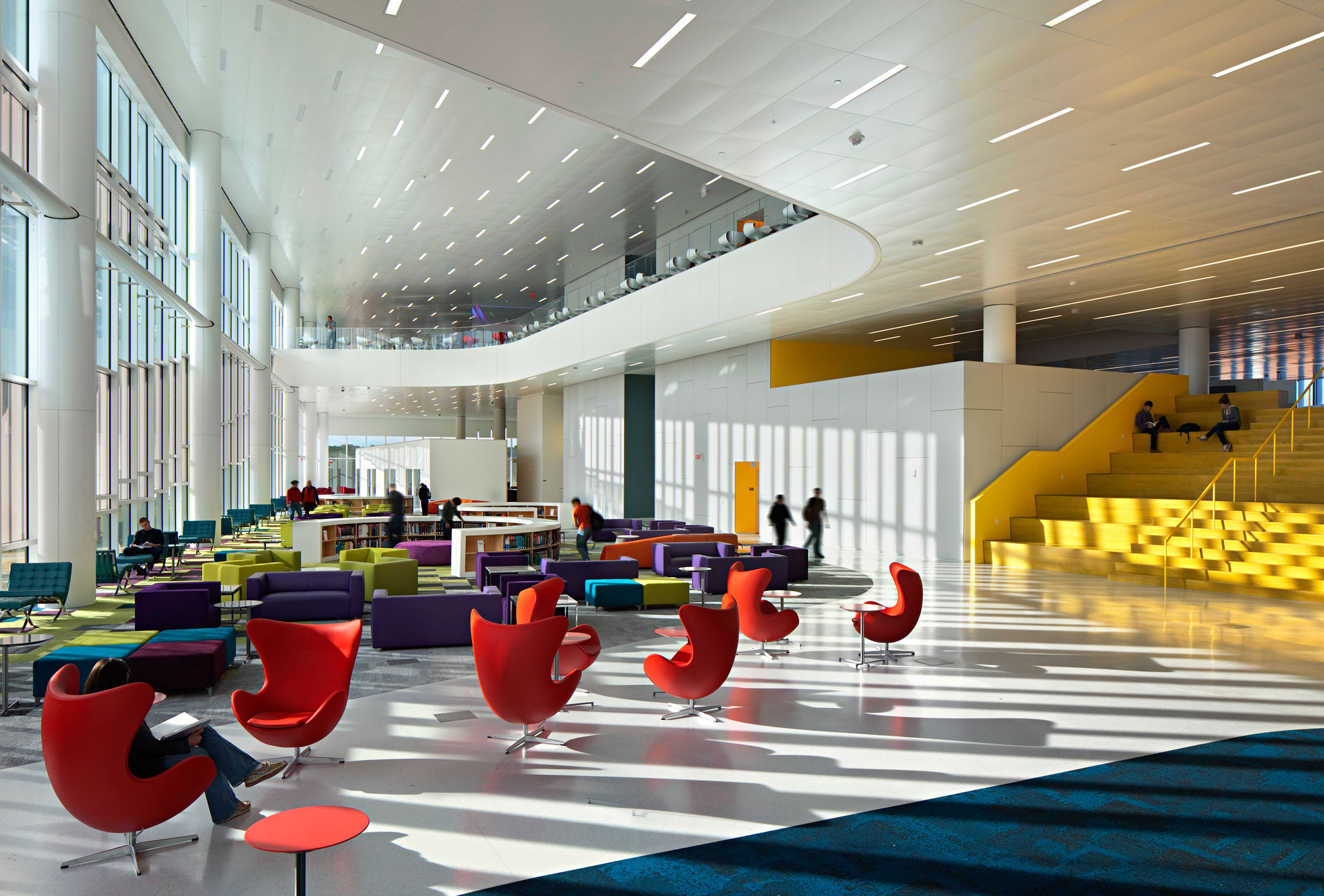
One innovation was the introduction of an automated book delivery system (ABDS), which effectively reduced the total area of the building by 200,000 gross square feet and allowed more space for collaboration and technology. The ABDS is supported by user-friendly browsing software that matches and even enhances the traditional pleasure of browsing a collection.

The design celebrates the power of chance encounter and recognizes the role physical space plays in the intellectual stimulation of users. Large open spaces connect all floors of the library, and the use of stairs is emphasized to ensure an interactive and social environment in-between more focused study areas.
Designed to LEED® Silver requirements, the building features abundant natural light and expansive views of the nearby lake. Fritted glass and a fixed external aluminum shading system help diminish heat gain and maximize views and ambient natural light. Ceiling-mounted active chilled beams and radiant panels provide heating and cooling. Rain gardens and green roofs manage storm water.
Oak Forest Neighborhood Library; Houston / NAAA + AWI + JRA

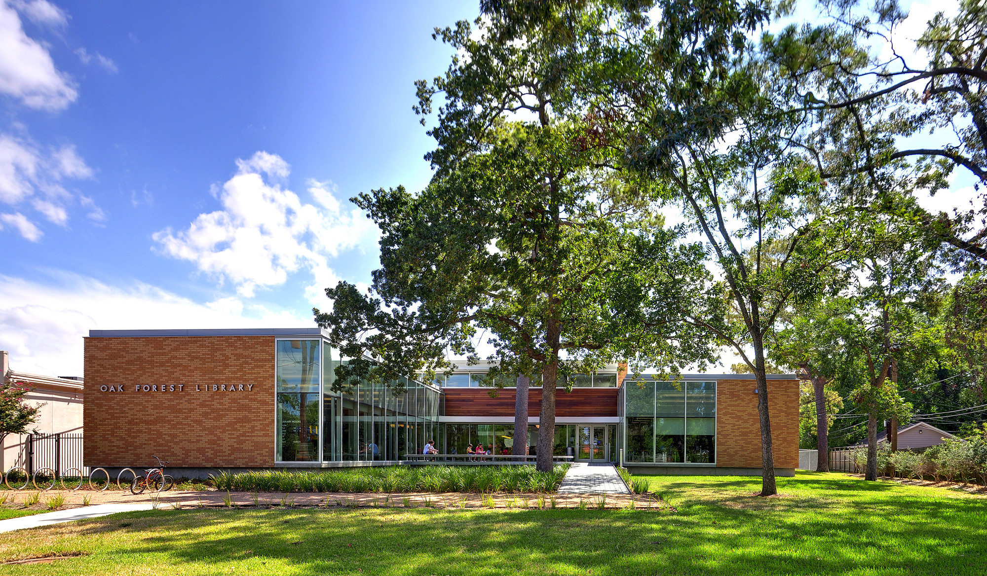
This 7,600-square-foot modern brick and glass structure opened in 1961. Fifty years later, there was still great nostalgia for the library’s mid-century modern design, but the building no longer met the standards of the Houston Public Library system or the needs of the surrounding neighborhood. The 2011 renovations and additions respect the character of the existing library and enhance its accessibility and functionality.
The original building’s restored signature green tile mosaic still graces the parking entry area on the north, but now the neighborhood is welcomed by a tree-shaded second entry and outdoor reading room framed by new dedicated adult and teen areas on the west. The original tile mosaic and globe light canopy of the old circulation desk were restored to create a toddler-sized reading nook. Each age group—from toddlers through teens and adults—now has appropriate facilities, furnishings, and technology. A new lobby and circulation space, lit by a continuous shaded clerestory, occupies the seam between old and new and unites the two entries.

The project exceeded the city’s sustainability goals and is only the second of its buildings to receive LEED® Gold certification.
South Mountain Community Library; Phoenix / richärd+bauer

The building integrates the varied uses of a contemporary public library with the needs of a state-of-the-art central campus library, allowing each to function both independently and collaboratively. The design is modeled after that of an integrated circuit, providing insulation between disparate functions and promoting interaction and connection between like functions and spaces.
The simple massing of the building is attenuated to focus views on the surrounding mountains and provide shade and transparency. The site was once home to fertile agricultural valleys and citrus groves, and the building consciously merges interior and exterior spaces to connect to the area’s rich history. A series of rooftop monitors and light shafts flood natural light into the first-level core. The rain screen, formed of bent planks of copper, calls to mind the pattern of an abstracted bar code. Variegated cedar strips reinforce the digital aesthetic of the building. Further echoing the design of a circuit board, building systems are organized and expressed within an internally lit independent distribution soffit.

Abstracted agricultural patterns are digitally imprinted on the skylight liners and laser-cut guardrails. Accessible flooring provides flexibility for power and data. The library includes a 200-seat meeting room, conference and multimedia center, high-tech classrooms, computer center, and a children’s area.
The 2013 AIA/ALA Library Building Awards Jury:
- Jeanne M. Jackson, FAIA, Chair, VCBO Architecture
- John R. Dale, FAIA, Harley Ellis Devereaux
- Charles Forrest, Emory University Libraries
- Kathleen Imhoff, Library Consultant
- Stuart Pettitt, AIA, Straub Pettitt Yaste
- John F. Szabo, Los Angeles Public Library
Project descriptions via AIA.


